Several years ago I worked as a quantitative methodologist for a large research center focused on how children develop and learn. One of the main ideas of this group was to translate social and developmental psychology theory into effective interventions to enhance social and academic outcomes.
My primary area of research was the development and application of novel statistical methods to better translate the kind of benefits that we can get from a conceptual simulation study into real-world settings where the application is often not so good. We had to solve all kinds of methodological problems and technical limitations (e.g., missing data; see Howard, Rhemtulla & Little, 2015) in a research space where over-simplified data analytic practices persist for decades. I found that the application of advanced statistical methods, particularly within the structural equation modeling framework, were really interesting in this context and very challenging.
One of our projects focused on progress monitoring of a new composite communication score to assess early language performance, quantify rates of development, and determine how individuals respond to intervention. What struck me was the enormous gap between the proposed statistical methods and the research questions.
As a statistical consultant, I worked closely with the research team to focus on the theory. This is a path diagram drawn by the primary investigator from one of those meetings that demonstrates a deep theoretical vision for language development.
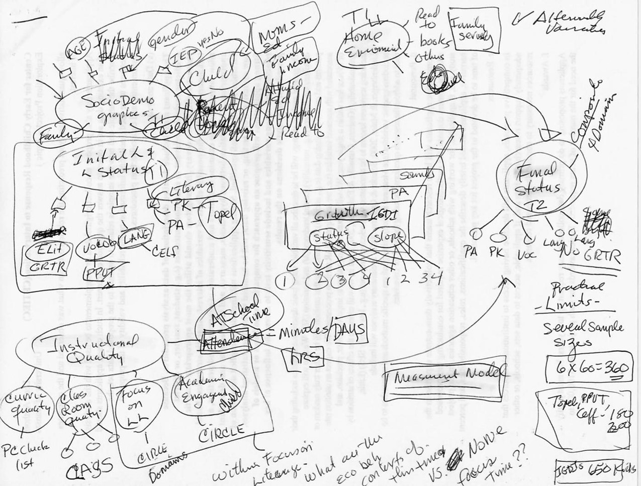
I often get diagrams like this and I love to see them. What I want you to notice is that there is a lot going on here, we have multiple processes interacting in some really interesting ways. In this diagram you see the forest rather than the trees – which is to say that we are not focusing on one regression path or mean comparison here, rather we are looking into a complex system and all the effects are within the context of all the other pieces of the model.
This is a plot of some data collected for this project.
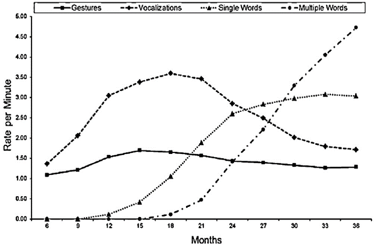
Notice that each line represents a different form of communication – so the flat line is gesturing, the line above that is vocalizations, we also have single words and then multiple words. Look at how vocalizations seem to peak around 18 months then decline – also referencing this peak notice how the use of single words is accelerating. The idea here is that children transition from one communication strategy to another and this tool seems to capture it.
The question is how to get from data collection with this tool to evaluating the theory of change illustrated above. Traditional approaches might include the creation of multiple-item scale scores (e.g., sum all the communication scales into a total score that are tested using ANCOVA or multilevel modeling - but where is this indicated in the theoretical diagram above? Consider how focusing on one communication measure at a time (i.e., gestures, vocalizations, single- and multiple-word utterances) or an aggregate of all communication scores misses the point.
We wanted to identify inter-individual differences in intra-individual change in language development. Unlike traditional approaches latent growth curve modeling allowed for a more accurate and flexible approach to analyzing repeated measures data by simultaneously modeling change in the means (variable-centered) and in the variance and covariance of level and change (person-centered) across all forms of communication shown in the plot above - within the same model. This model allowed for testing of precursors and consequences of change and multiple group differences in these trajectories and predictive relationships.
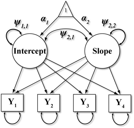
This figure illustrates an exemplary LGM model. Here circles represent latent variables, squares are measured variables, triangles are constants, double headed arrows indicate variances or covariances, and single headed arrows are regression weights. The key growth parameters of interest are mean intercept (α1), slope (α2), and the associated variances (ψ1,1, ψ2,2) and covariance (ψ2,1). These models allow us to explore the functional form of change over time, specify spline parallel process models or other novel features to better approximate our theory of change.
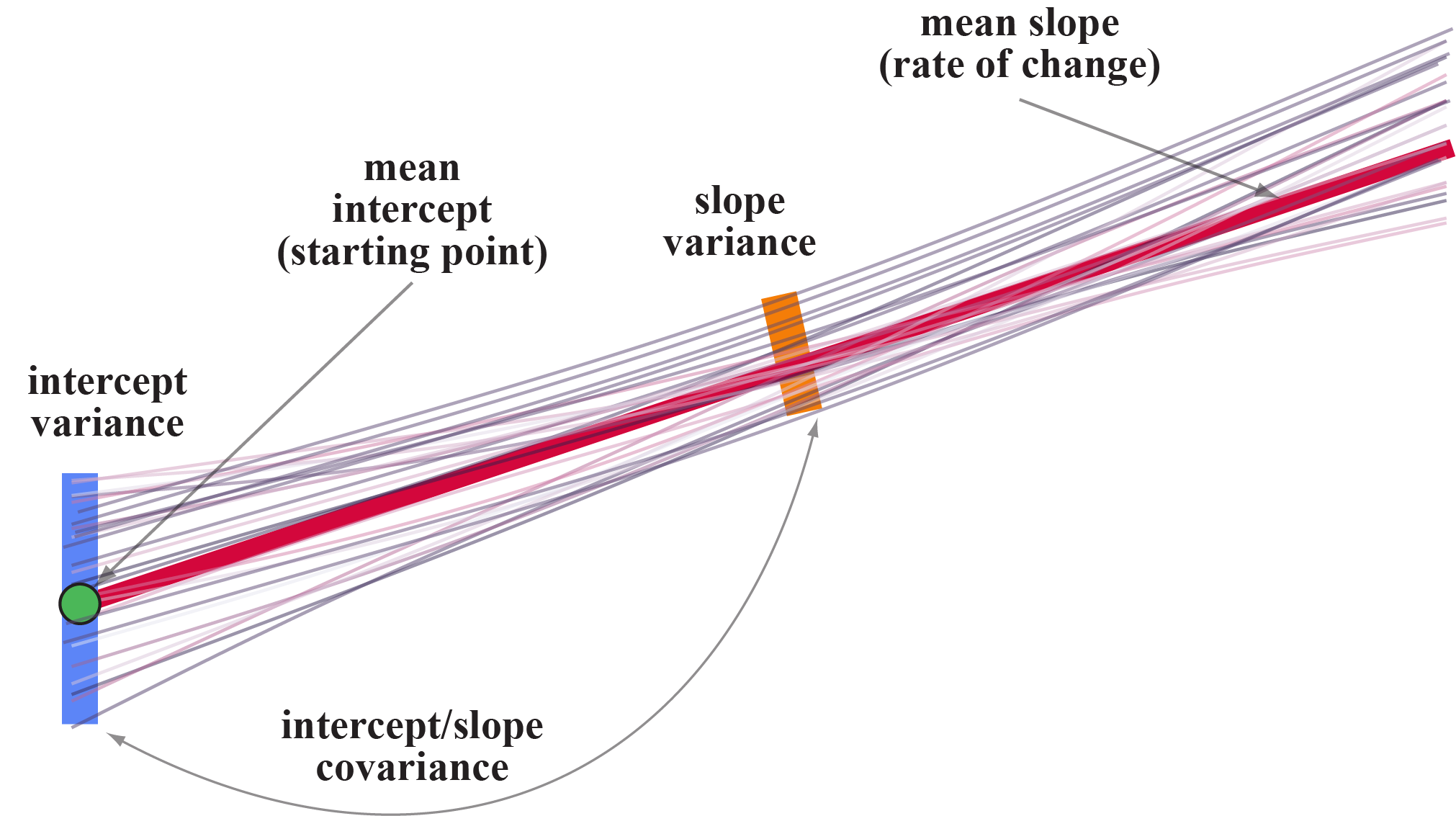
In this simple diagram, notice that each black line represents an individual that can have their own intercept and slope. Some start higher, some lower, some increase, some decrease, some are flat. Well, we can determine the average starting point (or midpoint or endpoint, etc.; α1) – denoted with a green dot here and also capture the variability around that average intercept (ψ1,1; the purple line). Similarly, we can estimate an average slope (α2; the red line) and variability around that slope (ψ2,2; the orange line).
This basic framework provides a great opportunity for us to think carefully about the model and our measurement of the change process while considering important factors such as: missing data, unequally spaced time points, non-normally distributed or discretely scaled repeated measures, complex nonlinear or compound-shaped trajectories, time-varying covariates, and multivariate growth processes among other features.
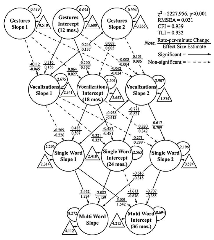
This diagram illustrates our final model. The interesting applied statistics problem here was the application of advanced statistical techniques to ask more sophisticated questions and tell more compelling stories.
Our vision is constrained by how we think about and use data. Too often we develop intricate theories about how the world works, which represent a lot of deep thinking about a topic, only to cut them up into smaller chunks that are then crammed into canned statistical procedures that were never designed to address the original question to begin with. I am committed to identifying such practices, providing modern demonstrations of their disadvantages, and explaining available alternatives, to discourage their further use. This requires strong communication with stakeholders who often want to know how (mediation) and when (moderation) predictive relations hold or are strong versus weak or want more flexibility in examining change processes over time.
For further reading:
-
Greenwood, C. R., Walker, D., Buzhardt, J., Howard, W. J., McCune, L., & Anderson, R. A., (2013). Evidence of a continuum in foundational expressive communication skills. Early Childhood Research Quarterly, 28, 540-554. [Impact Factor 2.364] (PDF, Cite, Source Document)
-
Greenwood, C. R., Buzhardt, J., Walker, D., McCune, L., & Howard, W. J. (2013). Advancing the construct validity of the Early Communication Indicator (ECI) for infants and toddlers: Equivalence of growth trajectories across two early head start samples. Early Childhood Research Quarterly. 28(4), 743-758. [Impact Factor 2.364] (PDF, Cite, Source Document)
-
Howard, W. J., Rhemtulla, M., & Little, T. D. (2015). Using principal component analysis (PCA) to obtain auxiliary variables for missing data in large data sets. Multivariate Behavioral Research, 50(3), 285-299. [Impact Factor 3.691] (PDF, Cite, Source Document)